I've been talking a lot lately about calligraphy, invitations and wedding papers, so today I'm sharing a little DIY tutorial for what I like to call "kinda-calligraphy." This is basically a way to get the look of calligraphy without being a professional and even without all the fancy calligraphy tools. While this certainly does not replace what a real artist can do, it could be a great budget-conscious option. It's also a good way to do hand-lettered signs because you could do this on just about anything, from a rustic piece of wood to a vintage window or mirror! This little trick took a little practice for me to make it look just right, but it is super easy to do. It's not a science by any means so just have a little fun with it and see what you like!
What you need: *Pen (I recommend something with a thin tip but that is a bit inky--I really like the Sharpie ball point pens, but whatever you have will work great as long as it isn't too thick) *Paper *Someone with nice cursive handwriting :)
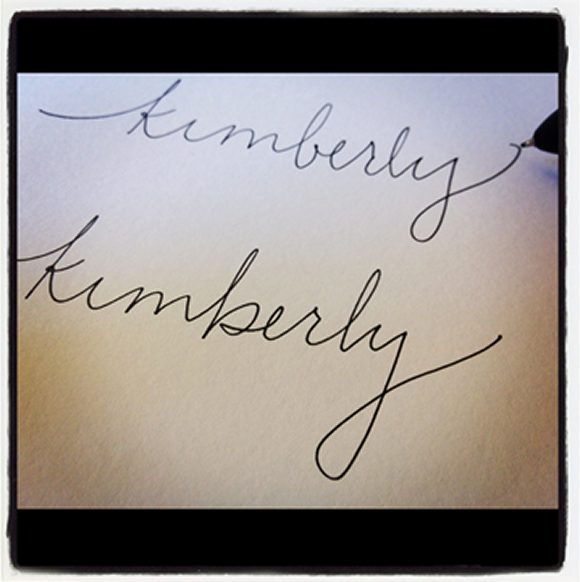
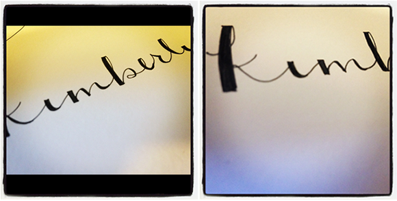
First, write in cursive whatever you want to have in the faux calligraphy (I picked my name because I played around with this quite a bit when I was designing the invitations.) Write it a few times. Try a few different styles. Get creative. Add some flourishes. You want to have some options for which to turn in to calligraphy.

TIP: Don't hesitate to look at photos of calligraphy online. For example, I really didn't like the way my lower case 'b' looked so I found some photos and borrowed their style. You can get good ideas for shapes, swooshes, etc. from just a Pinterest or Google Image search (or my post from a few weeks ago with some fun calligraphy inspiration).
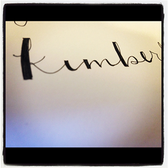
From your writing, pick your favorite--one where you like the shape and the spacing of the letters as well as any ornaments you've added. Now, you will essentially be building out the lines where you pen drew downward. This is how you mimic the look of using an actual calligraphy pen, which often has a wide tip and is drawn by angling the pen. I've just outlined them here you so you kind of see what I'm talking about.

Again, if you are ever unsure what to fill in, check out some photos online. Play around with it and see what looks right to your eye. This definitely does not have to be perfect, but it gives a nice feeling of calligraphy. I found that the flat top on the thick line gave a nice look as well.
Once you've filled in all the letters, you have your kinda-calligraphy word complete! At this point, you're all done if you're using it for a hand-lettered sign or address.

If you want to use your new masterpiece on something that will be printed such as an invitation or program, you should now scan the image so you have a file of it on your computer. From here, I brought the image in to Adobe Illustrator and basically traced the word so I had a digital vector file (or have a graphic design savvy friend help). To be honest, I'm no Adobe pro so there's probably a much better way to do this. Please share if you have any tips!
Full disclosure: I am not a calligraphy expert by any means, and just making this up as I go! Has anyone tried something like this before? Feel free to share any tips, tricks or other ways to use this!