Loving Calligraphy
April 18, 2012
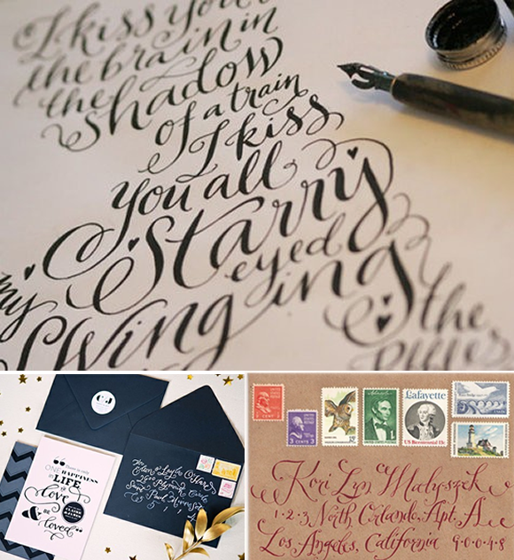
As I blogged about in my progress report last week, one thing on to-do-next list is work on invitations. I’ve been thinking of designing my own and have been doing lots of brainstorming about what I want. I have some fun inspiration that I’ll show another week once I start designing, but one thing I’m drawn to time and time again is calligraphy. I thought it would be a fun project to attempt to teach myself calligraphy and see if I could create something possibly as lovely as this inspiration.
What’s kind of amazing are how many styles of calligraphy there are! There’s the very traditional style with lots of swirls and ornaments.
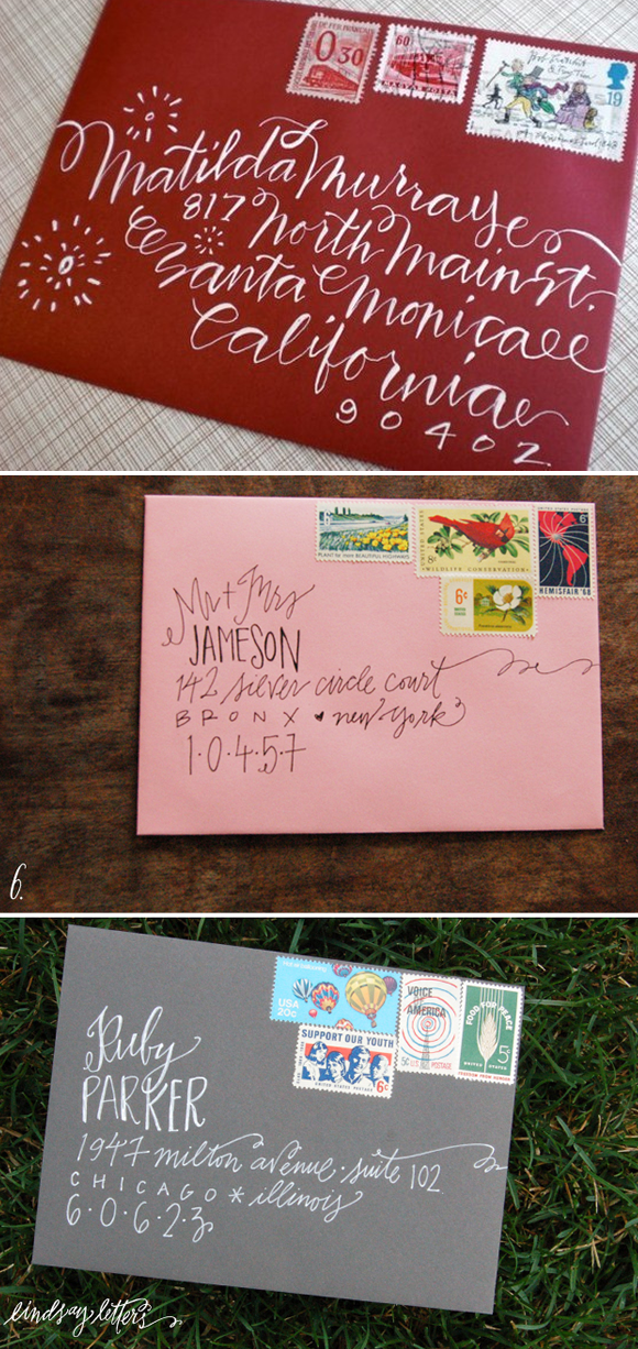
Lately I’ve been seeing a lot of this slightly more contemporary style calligraphy as well. I love the combination of calligraphy and other handwritten styles type.
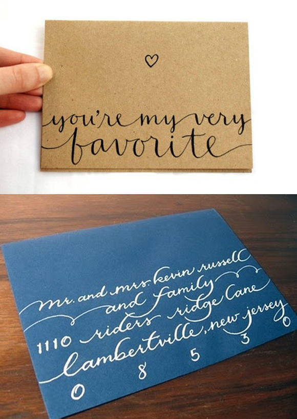
I think my favorite is somewhere in the middle–a classic and clean look. I also love the look of the attached words.
And I just love the look of this invitation all calligraphy. And with the striped envelope liner? Ahh, love.
What’s your favorite calligraphy style? Have you tried (or considered trying) doing your own calligraphy? I’d love to hear your tips, tricks or ideas!


[...] Last week I told you that I’m going to be designing my own invitations (along with sharing some gorgeous calligraphy), and I’ve had some fun gathering inspiration for the invites. To go with our backyard-style wedding, I want to keep the invitations casual, while still being sophisticated, personal and special. [...]
[...] OH, calligraphy!!! [...]
These are all SO great! I especially love the white ink on grey :)
[...] You can get good ideas for shapes, swooshes, etc. from just a Pinterest or Google Image search (or my post from a few weeks ago with some fun calligraphy [...]
hey my friend makes the beautiful artwork seen in this post! she is so amazing. her website is http://www.lindsayletters.com you should give her the credit :)
[...] writing Source Source [...]
[...] Spiff up those Christmas Cards …this ought to do it [...]
[...] I like to do my lettering first so that I can achieve the spacing and size I want before adding the detail. Time to decide on which type of font/typography you would like to use. My cheat? Looking online for help! I suggest searching typography on pinterest or looking on dafont.com for lettering inspiration. I have an entire board on pinterest dedicated to fonts and type and I am always going there for reference. For this card I pulled inspiration from here and here. [...]
Thats very cute, but if you’re addressing envelopes this way, it’s going to be a nightmare for a postal worker. Especially this time of year, postal workers are sorting through millions of pieces of mail everyday. Zip codes are meant to speed up this process at a glance. However, too much of this is distracting and makes their job worlds harder.
Please, think of the postal worker this holiday season when you’re addressing your envelopes. Clear, legible addresses make everything run smoother. Keep the calligraphy for inside the envelope.
Thanks Adrienne. Although very pretty, addressing your letter in this way is a nightmare for mail carriers. Also red and green envelopes addressed in black, silver or gold ink. As a mail carrier I wish to warn you in the world of mail automation addressing this this way can cause a delay in delivery.